
PROJECT OVERVIEW:
Phishing Exercise Results: Monthly Sector Infographic
Designed a visually engaging infographic to communicate complex sector phishing exercise results and reinforce cybersecurity awareness.
DESIGN TYPE:
Infographic
AUDIENCE:
Enterprise sector employees
THE PROBLEM:
Monthly, the Cybersecurity team compiles the previous month’s phishing exercise data into a single comprehensive PowerPoint report.
These large reports were in a dense, text-heavy formats that:
Limited employee engagement
Made it difficult to quickly understand the results for each sector
There was a need to translate complex security data into a format that was digestible, visually appealing and easily editable in order to create multiple versions for each sector each month.
GOALS & OBJECTIVES:
-

Increase employee engagement with phishing exercise results.
-

Reinforce recognition of phishing indicators.
-

Clearly communicate enterprise risk metrics.
-

Produce a template that can be edited to serve each sector’s results.
MY APPROACH:
I approached this as both a data visualization and behavior-change communication challenge. The infographics each month would be housed on the Are You Cyber Safe? intranet site and shared in sector newsletters.
-
1. Content Prioritization
Focused on the most impactful metrics: delivered emails, click rate, reporting rate, and repeat offenders, while simplifying technical language for a broad audience.
-
2. Scannability & Clarity
Used iconography, color coding, and emphasis on key metrics (e.g., susceptibility rate) to support quick comprehension.
-
3. Template Design for Scale
Built the layout to be easily editable, enabling efficient creation of monthly, sector-specific versions.
THE SOLUTION:
A modular infographic designed for both clarity and scalability, featuring:
Executive-level summary metrics for quick insights
The month’s real phishing exercise example to provide context
Highlighted warning signs to reinforce learning
Performance metrics dashboard to communicate results clearly
The design balances data visualization and behavioral reinforcement, making the content both informative and actionable.
RESULTS:
Additional graphics created using the template:
Click to enlarge
-

Successfully transformed a dense reporting format into a visual communication tool
-

Enabled consistent monthly reporting and increased relevance through sector-specific reporting
-

Improved clarity and accessibility of phishing exercise results
Other Featured projects
-
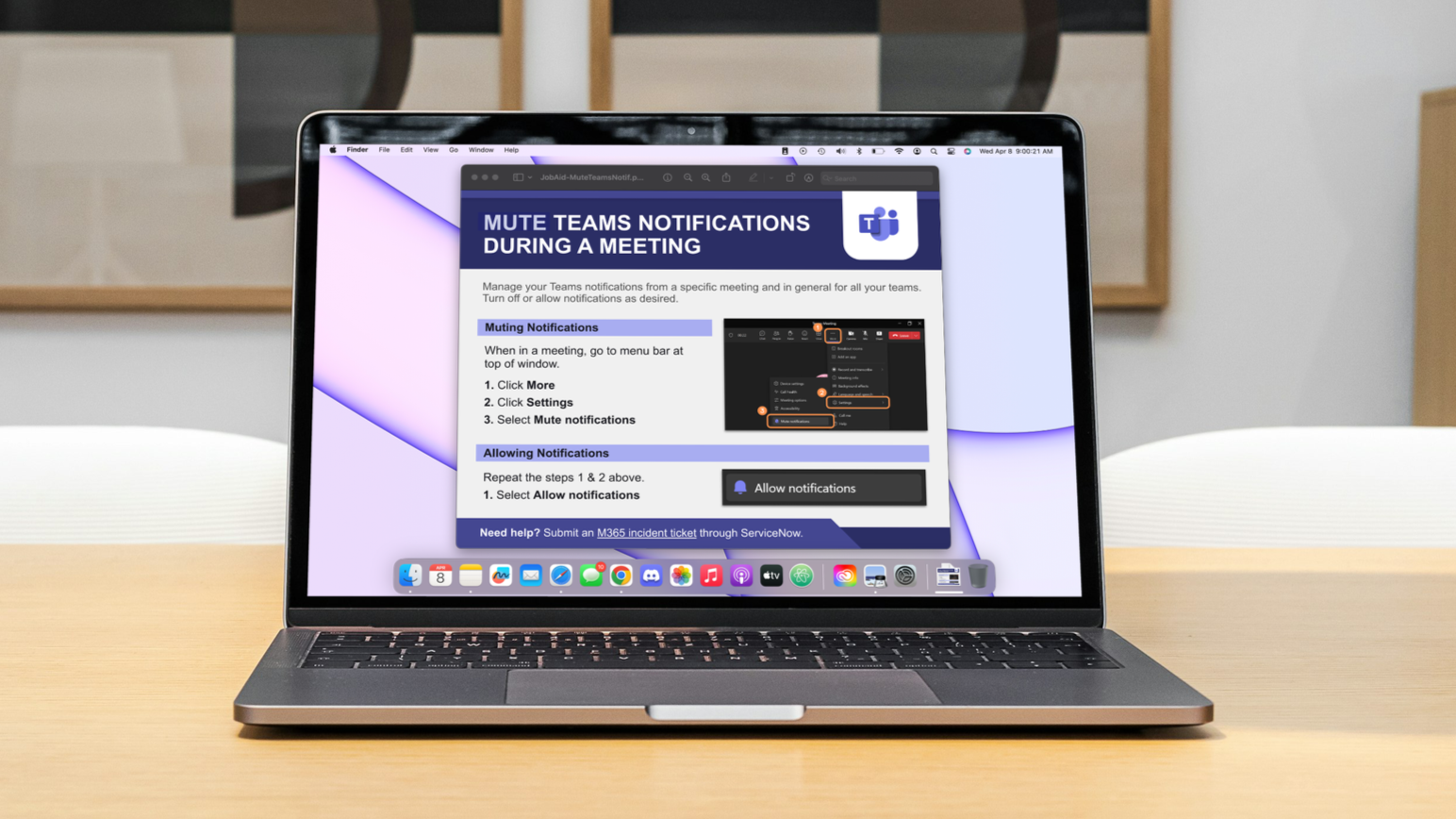
Job Aid
Microsoft adoption
-
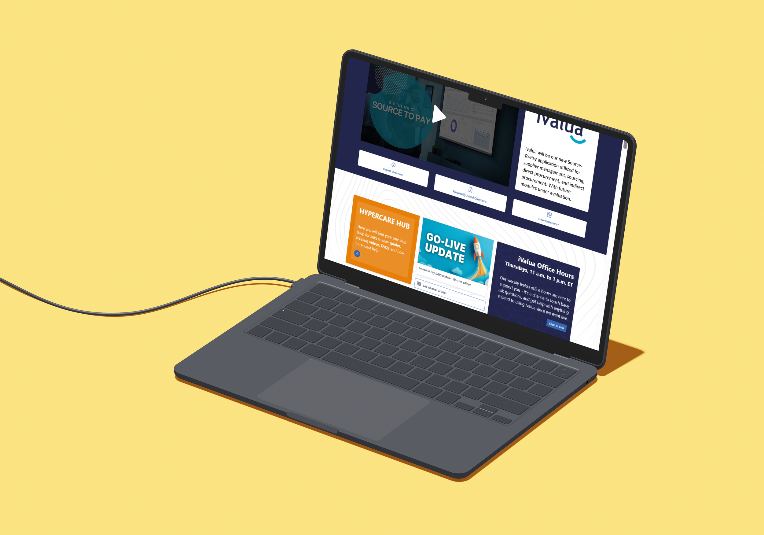
Intranet Page
Source to Pay Ivalua site
-
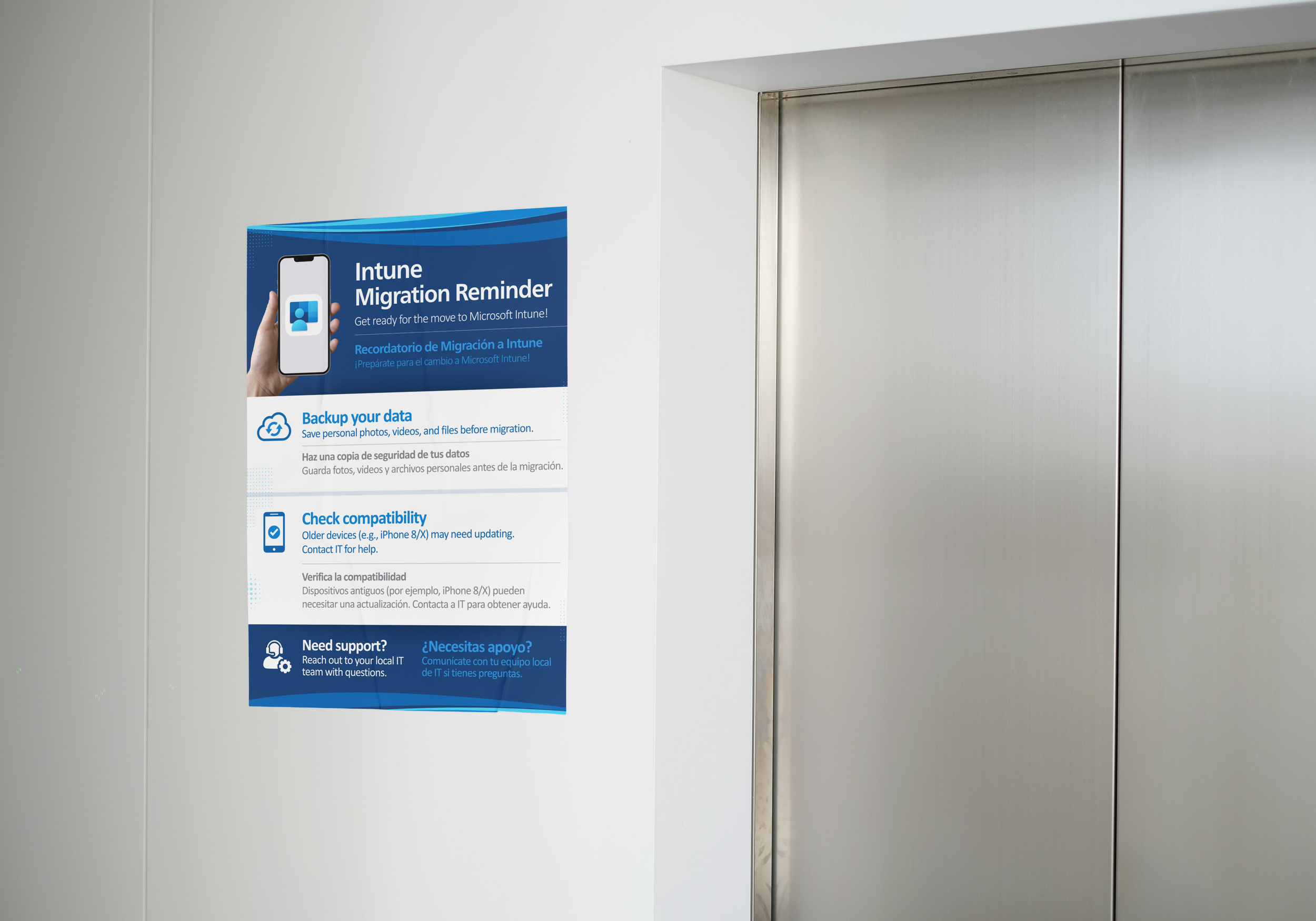
Print Flyer
Intune Migration Reminder
-
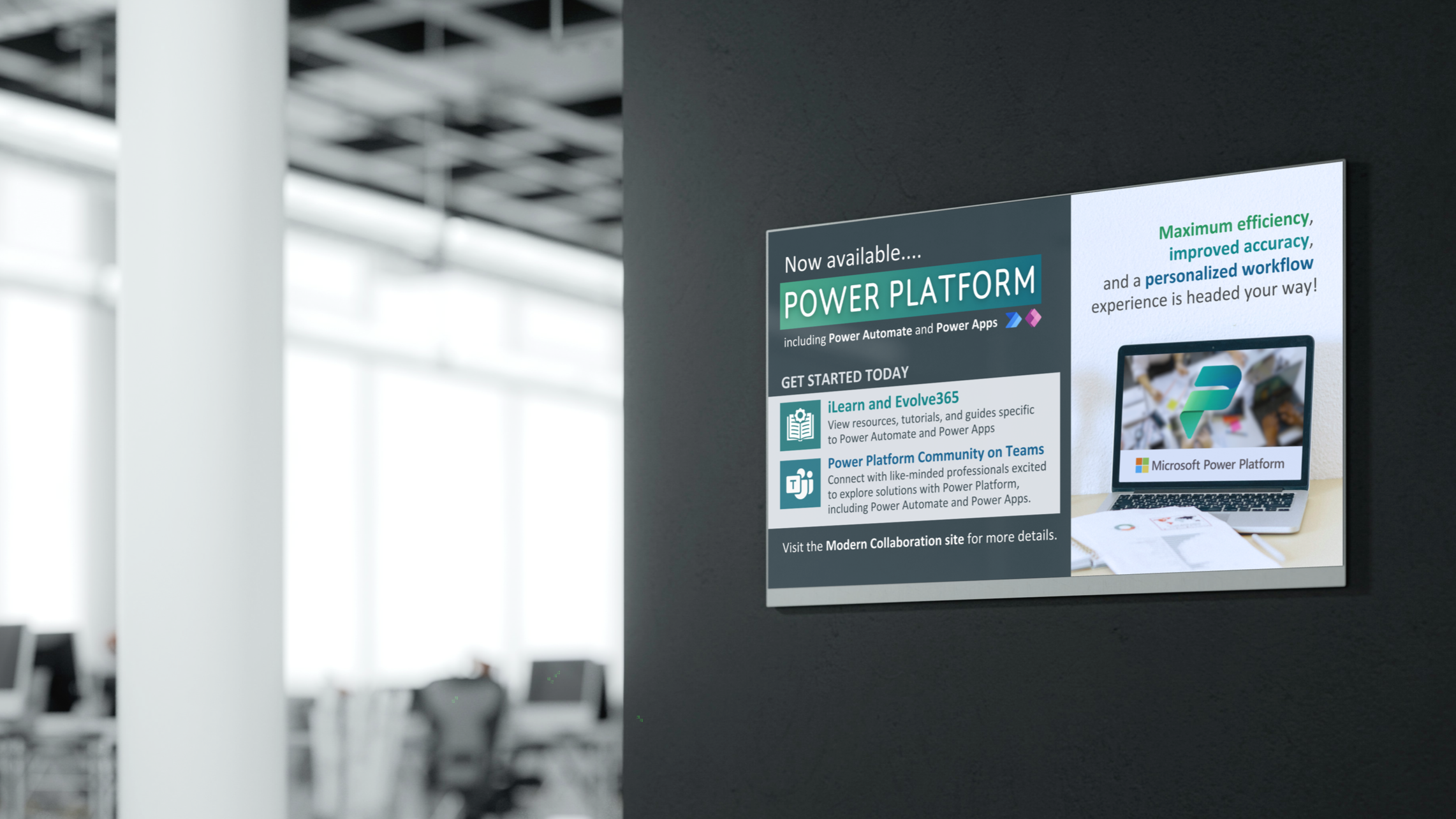
Digital Signage
Power Platform